Vimal Patel20/04/21
10 min read

With technology moving at an ever-increasing pace, typically most charity websites require a major overhaul, or complete redesign, every four to six years. But what best practices should you consider when starting to plan your next site?
A great starting point when it comes to charity web design is to take time to consider your site’s primary users and identify their future needs.
Designing a charity website is often particularly challenging, as you will usually have a wider diversity of users than most – each with their own needs. For example, many charities’ sites serve:
The site should be sufficiently balanced to serve all of the above. Therefore, a useful exercise is to document website personas, giving you and others involved in the project a clear idea of who the website is for and what each of these personas needs from their experience.
Depending on the time and resources you have available, you may also wish to go one further and undertake research with typical users, perhaps in the form of surveys, research groups or one-to-one interviews. However, be conscious that you will often be obtaining opinions from a very small proportion of your site’s total user base and therefore always balance qualitative feedback with historical data from your website (more on that below).
Adopting a user centred approach from the start will pay dividends in the long term and will certainly help to inform many aspects of the site’s design and functionality.
Once you’ve considered the diversity of stakeholders, it’s important to define what success looks like. For beneficiaries, the objective might simply be to ensure that relevant information is easy for them to find. Other objectives will be more measurable – for example, increasing the number of onsite donations and the average value of these.
Wherever possible try to document your current site’s performance and then set key performance indicators (KPIs) for the new site. Having clearly defined objectives from the onset will help to ensure that your charity is focussed on creating a site which will meet the desired outcomes.
There are tools at your disposal which can give you a great deal of insight into how users are interacting with your current site. For example, Google Analytics and Google Search Console can provide you with a wealth of information around how users find and interact with your website. This data can help you set the aforementioned KPIs, identify areas that need improvement, as well as highlighting high-performing aspects which should be preserved in the new site.
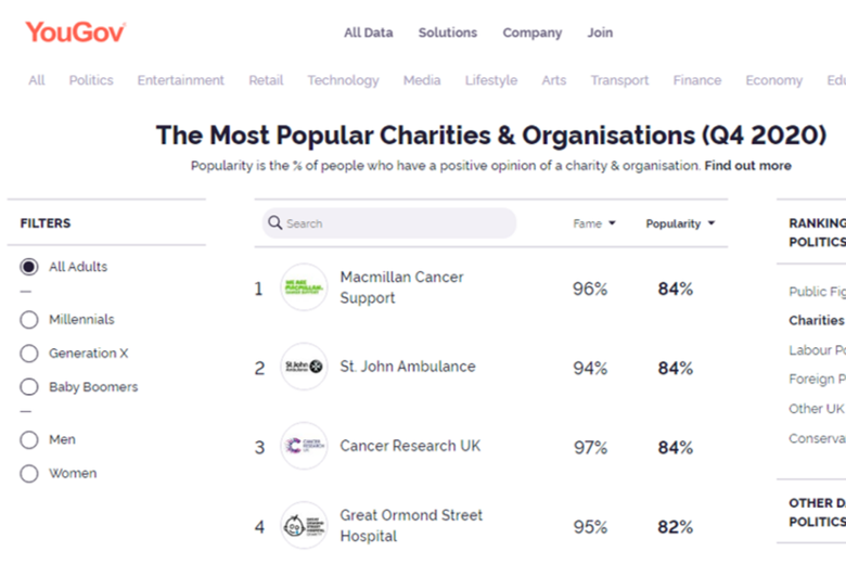
As well as being introspective, study examples of as many other websites as possible, to find elements that you’d like to recreate. In particular, review some of the most popular UK charities’ websites for ideas and inspiration. They are more likely to have used a specialist agency and followed best practice, which you can then emulate on your new site.
Quite simply, don’t rush the planning process. There’s always the temptation to get moving quickly with images and copy but careful and considered planning is fundamental. It also minimises the risk of additional cost being incurred further down the line – reworking elements towards the end of a project can often cost time, money, or both.
During the early planning phase, be realistic with yourself and your stakeholders about timescales and budgets. Digital projects invariably take longer than is initially expected and building in generous timescales alleviates unnecessary pressure.
A carefully planned structure is fundamental to any successful website build and should be part of the early planning phase. This is particularly the case for third sector organisations, where there is often a greater diversity of users to be considered.
A practical way to begin planning a structure is to use a tool such as Microsoft Excel, to create a hierarchy chart which can map out where each of the key pages sit. As a general rule of thumb, no page should be more than three clicks away from the homepage, to ensure both users and search engines can easily find the content. Amongst other benefits, your chart will help you to ensure you’re sticking to this principle.
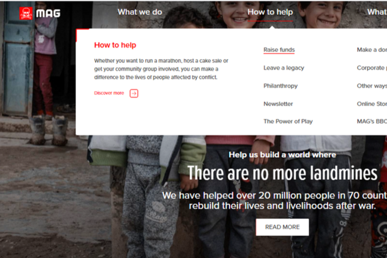
Navigation is intrinsically linked to site structure and therefore the two should be considered hand-in-hand. Put simply, navigation enables your users to find what they’re looking for quickly and easily. If they can, then search engines such as Google will also look favourably upon your site.
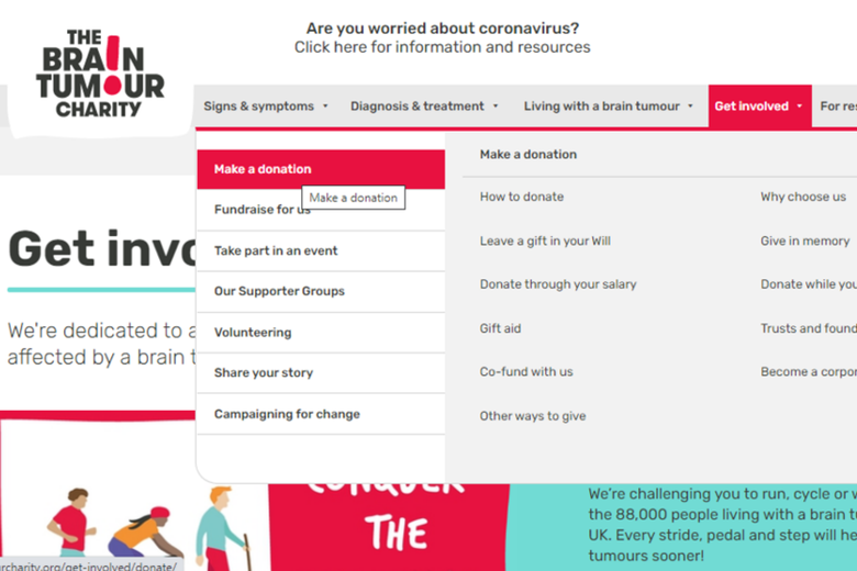
With most websites, the majority of visitors arrive on pages other than the homepage, which makes navigation even more important. Some aspects to consider include:
Naturally, your new website should comply with your brand guidelines. However, from a visual perspective it’s better to restrict the site’s colour palette to a maximum of three to four prominent colours. Accordingly, try to be sparing with the number of colours you choose to deploy from your guidelines.
Far from looking dull, a reduced pallet will help photographs and other images to stand out on the page.
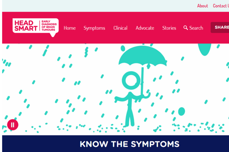
Simplicity is often underrated. An uncluttered, almost minimalist approach allows page elements to breathe and the compelling visuals to stand out even more.
It’s equally important to think about visual hierarchy, so that visitors naturally gravitate towards what you consider to be the most important elements.
Consistency is also key. Various parts of a website serve different purposes and therefore the layout of pages will vary. However, for an optimum user experience, try to minimise the number of different templates used. Designed carefully, these templates should help maintain a consistent look and feel across the site.
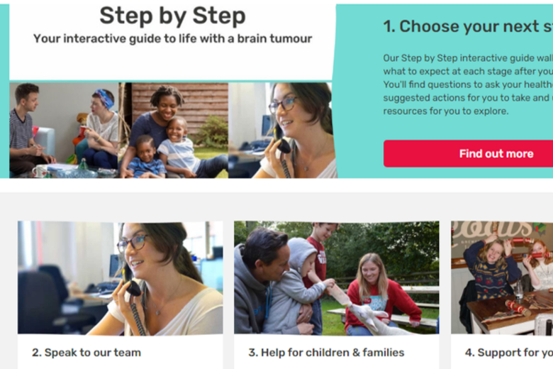
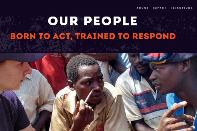
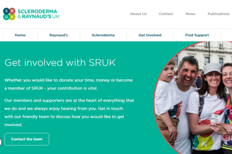
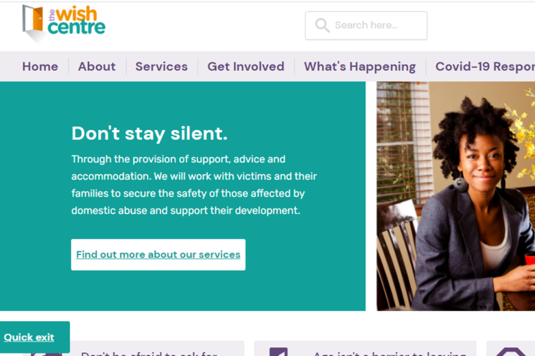
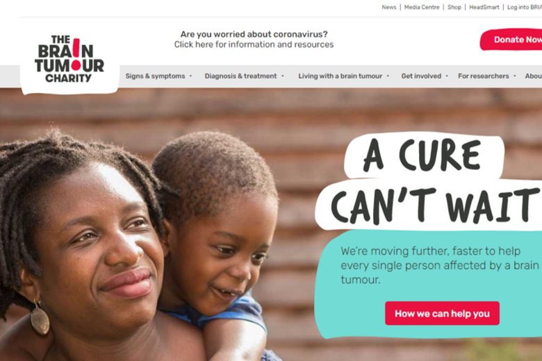
…and so we’ll keep it brief here. Suffice to say, great photography can work wonders for your new site. If you don’t feel your internal library has a sufficient number of high quality images it’s worth considering supplementing your own photos with stock images.
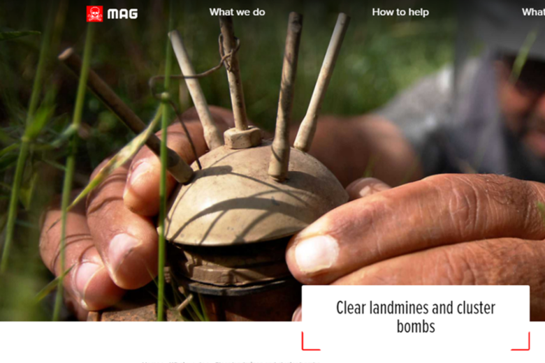
It’s also worth bearing in mind that showing people in your imagery – and in particular faces – can have a very positive effect in terms of user experience.
This Guardian article offers some great tips and ideas on how to use imagery to set a tonality for your site and appeal to your prospective supporters.
All pages are equal, but some are more equal than others. The homepage usually requires particular thought and attention as it’s such a highly visited page. For some, it’s the first page they arrive on and, for many others, it’s the second page they view after landing elsewhere on the site.
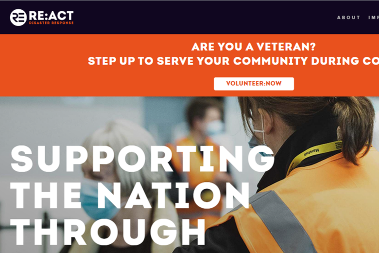
When designing the homepage, ensure that your organisation’s clear, compelling value proposition is stated early on – ideally within the top banner and above the fold (i.e. your users see it without the need to scroll down).
The homepage should also link to some of the key sections in your site – helping users and search engines like Google to quickly find your primary content.
It can be easy to forget that many users of your website may not be familiar with your organisation and the great work that you do. For example, some visitors could be a potential donor who has a friend or relative effected by the issues your charity supports, or perhaps a trust is learning more about you after a recent funding application you’ve made. Irrespective of the circumstances, it’s important to build credibility and trust with every visitor.
The homepage and ‘About us’ page are two prime opportunities to demonstrate your outputs and give a clear, compelling reason why your charity merits support.
Your design can help build trust by incorporating elements such as:
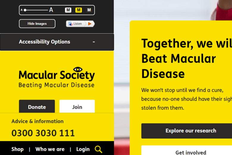
While many elements are down to choice, there are some fundamental aspects which should always be adhered to, particularly with regards to accessibility guidelines.
For the best user experience, it’s also important to keep the reader fully engaged. Try to use plain English, plus keep sentences and paragraphs relatively short. Also, break up blocks of copy by interspersing images, call-to-actions, examples of your work, or quotes.
Ensuring visitors can reach out to you in the most convenient and appropriate way is another aspect of best practice. Interaction takes many forms, including:
You’ll often want users to take some form of action whilst visiting the site, including:
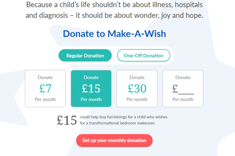
It’s therefore important to think carefully about call-to-actions (CTAs). These typically take the form of buttons, which may lead to a transactional page, or alternatively a form where the user provides more details.
Try to ensure CTA buttons remain as consistent as possible, site-wide, in terms of their visual appearance and the wording they use. These should also be relatively prominent, perhaps being placed consistently in the site’s header and footer, as well as elsewhere.
Conversion rate optimisation is an ongoing task for any website and it’s an important consideration from the onset of your new site’s design process, especially as plenty of other organisations are competing for mindshare and donations.
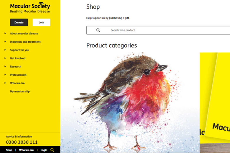
Many third sector websites incorporate transactional elements such as shops, event booking systems and, of course, the ability to donate online, either through a generic or bespoke donation platform.
Before you commit to a particular agency or platform for your website build, fully research the merits and costs of introducing newer transactional tools versus migrating your existing systems. As part of this process, consider how you might improve aspects such as the donation experience, by reading this study on donation usability.
CRM integrations – with the likes of Salesforce, Microsoft Dynamics and Raiser’s Edge – are also commonplace and again it’s best to undertake due diligence in the early phase of design.
As already acknowledged, user experience is paramount and part of this is ensuring pages load quickly. If they don’t, users become frustrated and leave.
Some quick tips:
Mobiles now account for half of all website traffic worldwide. Accordingly, users and search engines now expect the mobile experience of your site to be on par with the desktop experience. It’s therefore vital to carefully consider mobile from the onset.
During the design phase, avoid making desktop elements too complicated, if there’s a suspicion that they won’t migrate well to a mobile or tablet device.
As discussed in articles such as this one, the footer (i.e. the strip at the bottom of most sites) plays a more important role than you might otherwise think. Yes, it contains some of the dry stuff, such as your registered charity number and links to the legalities, but users will often interact with elements within it, such as social icons or navigation links.
There are a variety of platforms that your website can be built on – from various builders at the cheaper end of the scale, to more premium options, such as WordPress and Django. Choosing the right one for your organisation will certainly have a bearing on how successfully the site functions for your needs. Therefore, it’s best to be familiar with all of the options available to you.
It’s also worth evaluating in advance the flexibility of the content management system (CMS) that will be available to you after your website launches. The more versatility the better here, as this will enable you to add to your site and make design tweaks independently, without incurring additional developer costs.
And so, to the final best practice point – and we’ve saved an important one until last. SEO (Search Engine Optimisation) is an expansive topic but, suffice to say, a well-designed site should always incorporate the fundamental elements that contribute to SEO success.
It’s generally the case that what’s good for user experience (often referred to as ‘UX’) is also good for SEO. However, that doesn’t necessarily mean that a good website experience at face value incorporates all of the elements required for success in Google and the other search engines. Therefore, it’s highly recommended that the fundamentals of SEO are used as a checklist from the onset.
As you can see, there are a variety of aspects to consider when designing any new website and this is especially true in the third sector.
We are one of the UK’s leading digital agencies for charities, not-for-profits and ethical organisations and so if you’re planning to redesign your website please contact us today, as we’d love to chat to you.
Share this:


Vimal Patel
Founder at Giant Digital
Vimal is Commercial Director and founding partner at Giant Digital. With digital expertise gained from over 20 years in the sector, combined with his experience as a charity Trustee, Vimal has a detailed understanding of the challenges faced by charities and is passionate about finding effective digital solutions that bring about lasting positive change.